Life drawing record from study block 2. Aim of putting these together as record, as a means of reflection on development, and as a reference resource.


Life drawing now 2 or 3 times per week to gather figurative forms for later work, to build skills in terms of ‘dry media’ as well as observation. Another reason for doing it is to build greater confidence in the use of line, tone and value. One lens that I’ve been bringing to the life drawing is the need to create ‘atmosphere’ as an integral component of the storytelling aspect of my practice. 30/4/22.


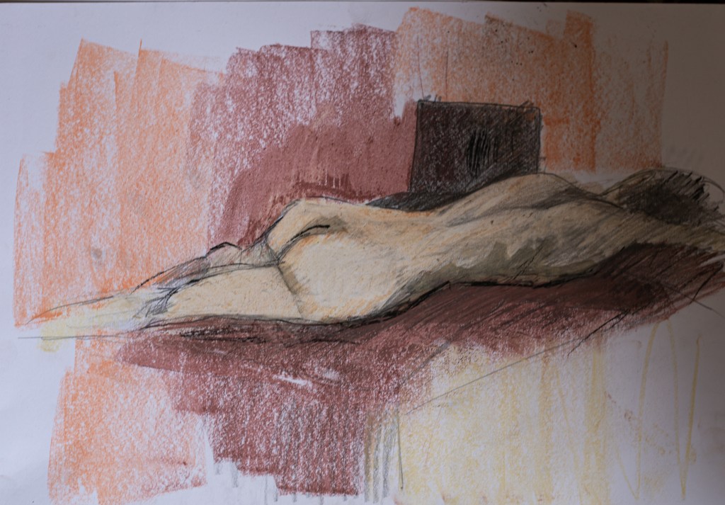


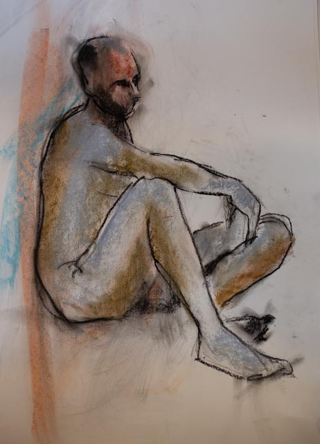
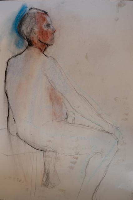
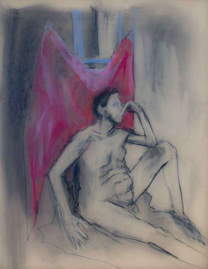
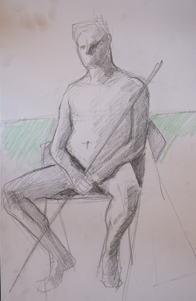
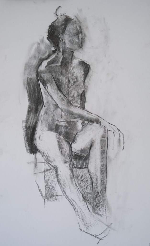
Above life drawing in various modes (online and in life) the week of 16th May – 24th May. Some are better than others! Various materials. The chalk – 45 mins pose – seemed to work well – modelling is more distinct and the colour combination helps with conveying a sense of atmosphere. The pencil/graphite work doesn’t translate into photography particularly well. but I like the ones where they are ‘barely there’ – fragile, seemingly fleeting. What I feel is missing in my linear work is a ‘lively line’ – this needs more consideration about how to achieve that. Is it to do with grip, medium, too much uniformity of touch? Easier to get a varied line digitally – oddly enough! Thinking of the vitality of Rackham and my good friend Dane Watkins’ linear work.


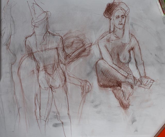
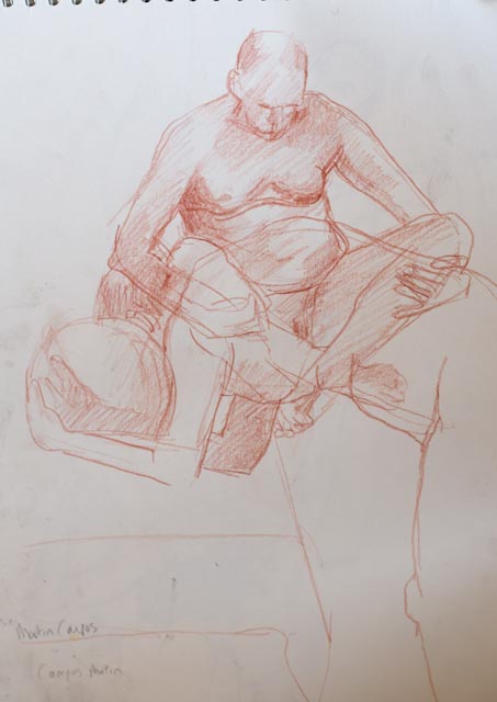
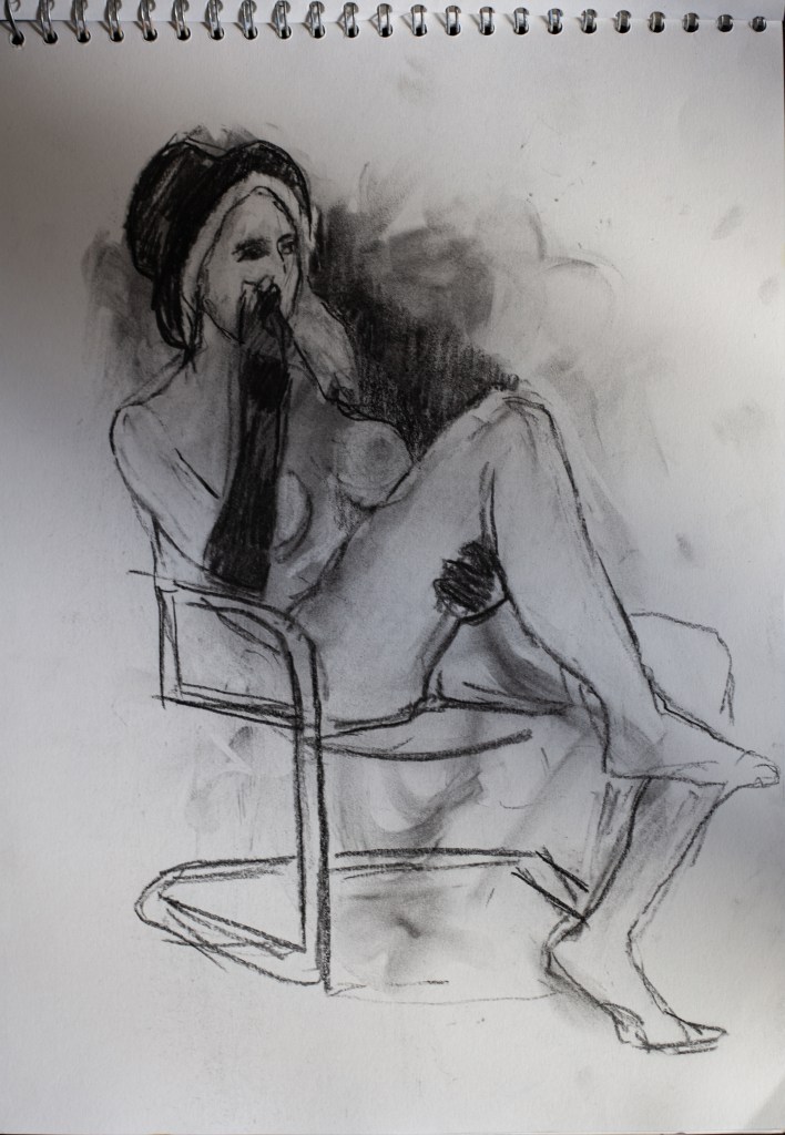
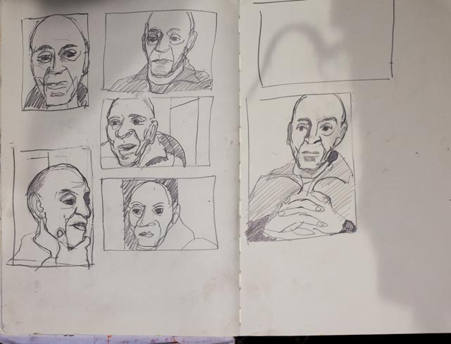
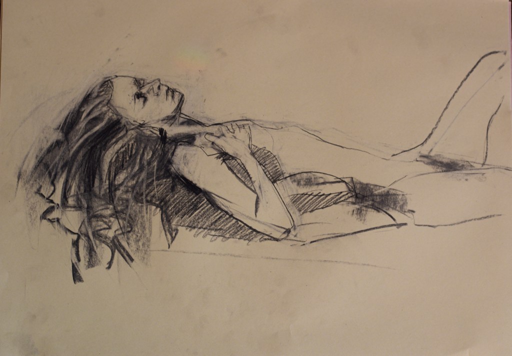
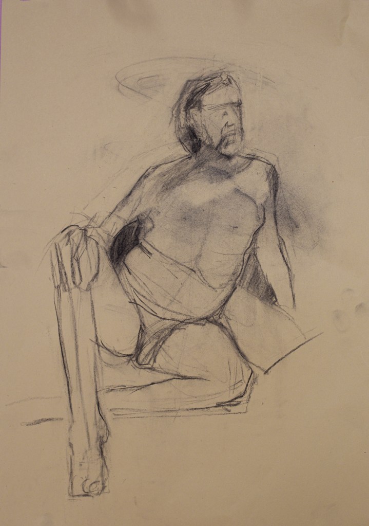
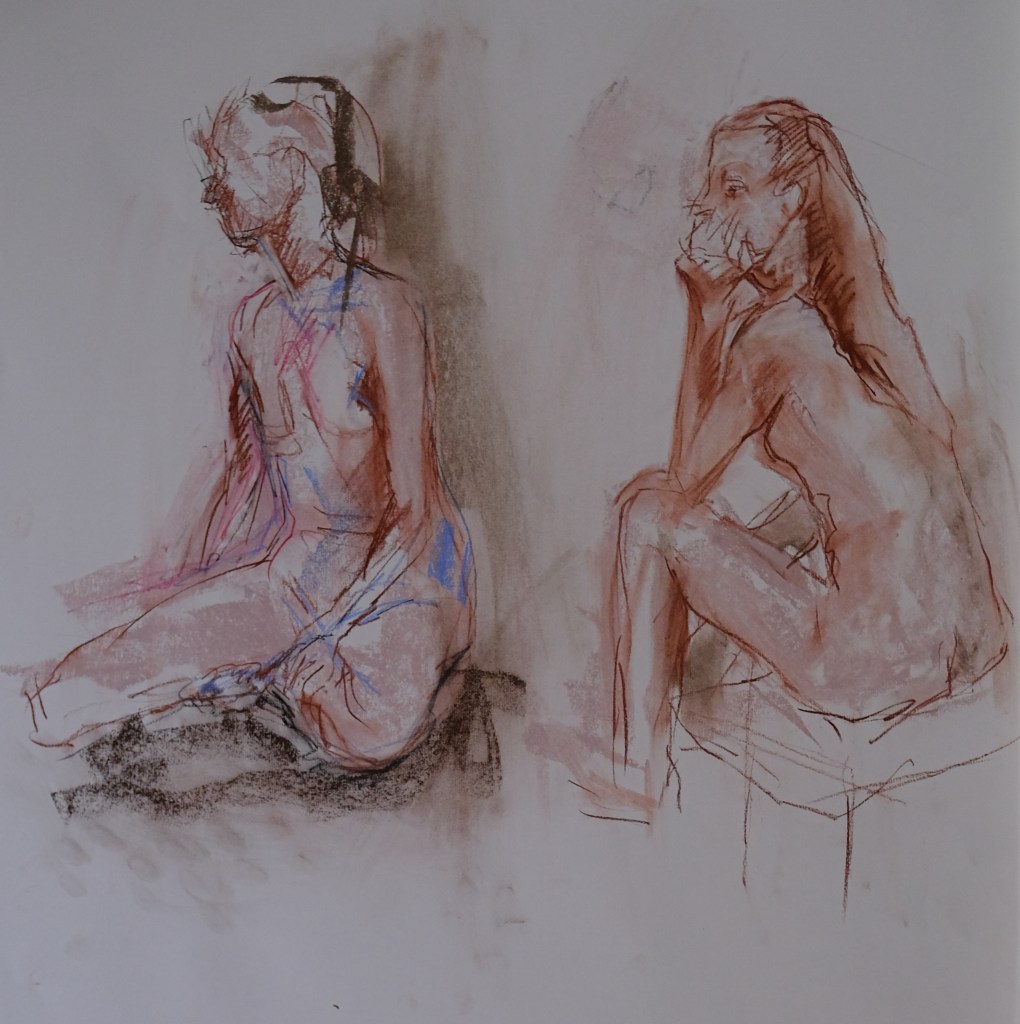
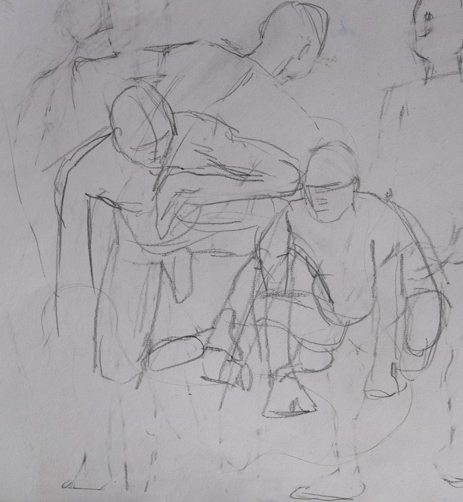
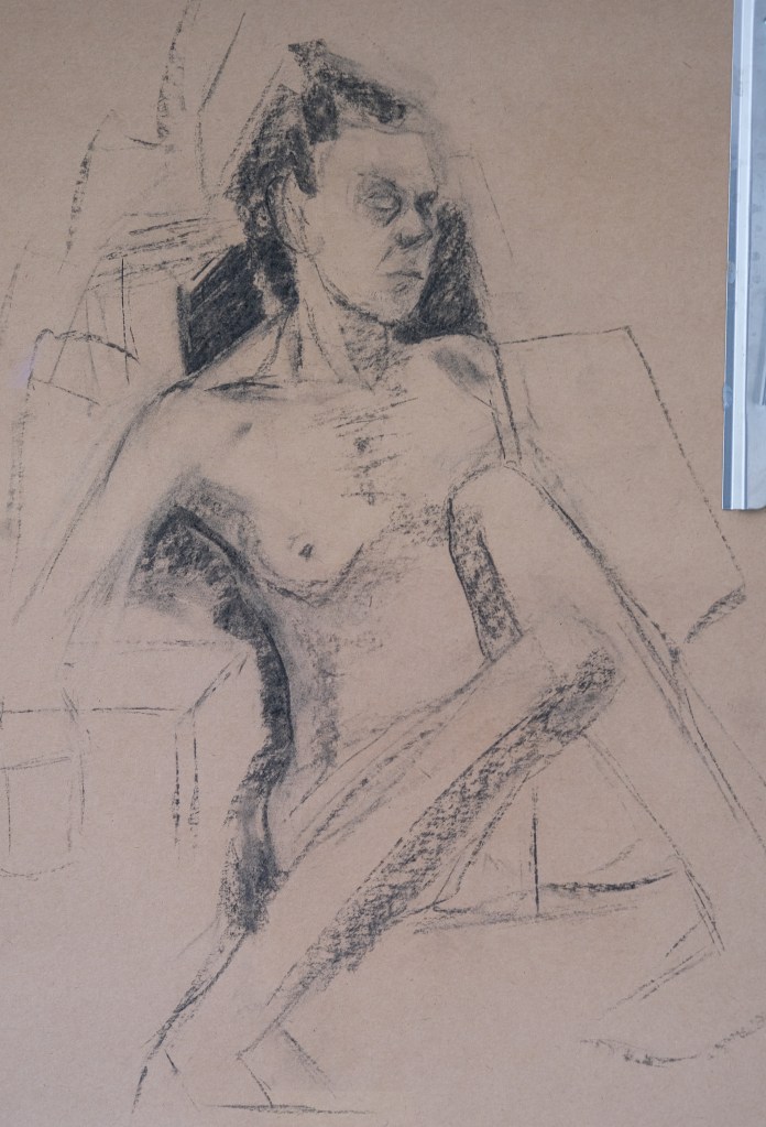
a few examples of working with linear lines rather than blocks of tone – still not the fluidity of line yet that I am aiming for (Jack Spicer does it well)- more practice needed with that but the work is getting bolder and more confident.


I’m now asking myself where I am going with all this figure work. I guess the answer is…building facility, exploring form and playing with colour and line. Do i need another direct purpose? Probably not 😀


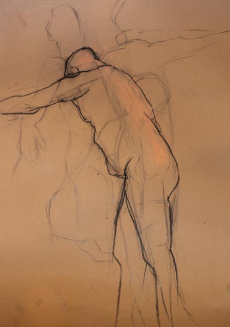
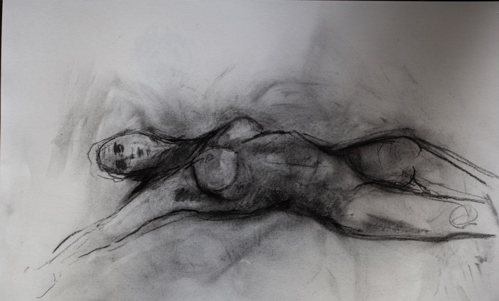
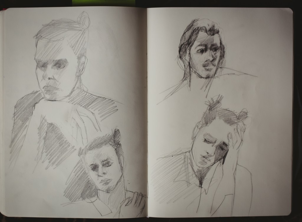
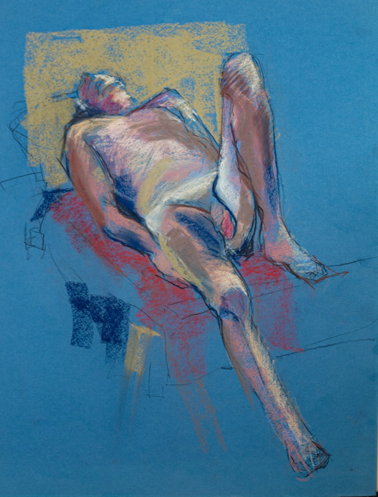
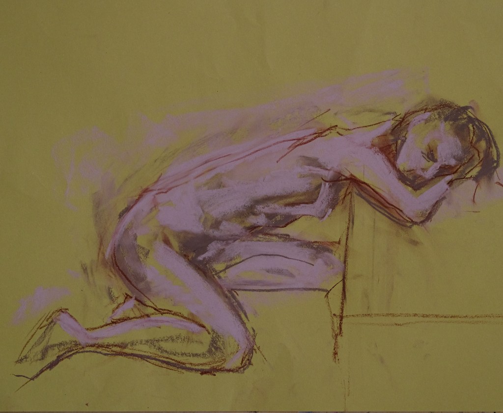
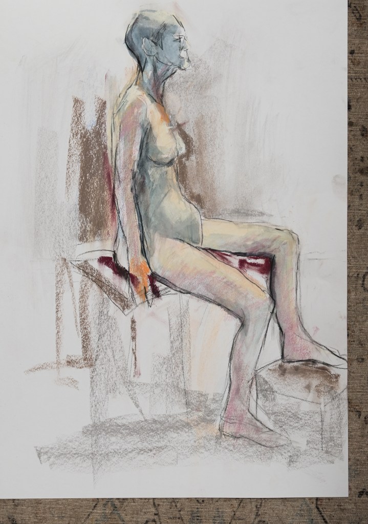
These were done one evening, 2 hour session. Quick versions seem to be the more interesting. I pursue form through line in the last one – i think that was quite interesting and built on an image above that was made with different coloured lines to trace contour shapes (conte).


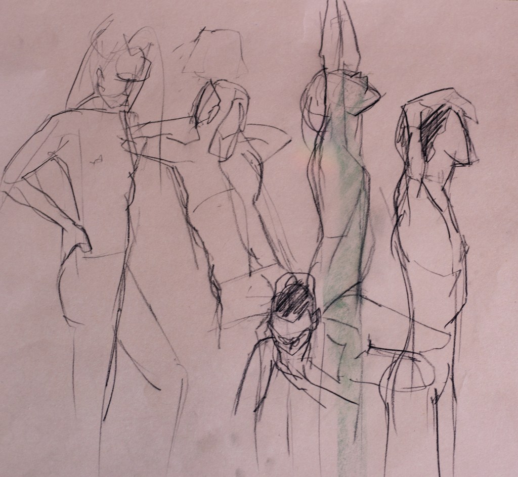
25/06/22 St Ives – 2.5 hour session (model didn’t show up so generously another artist modelled)


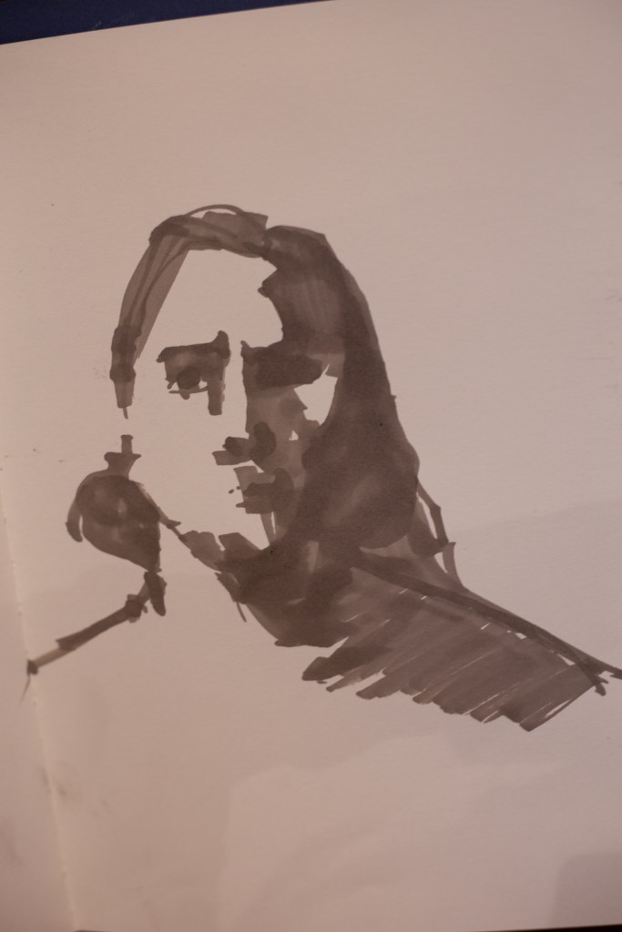
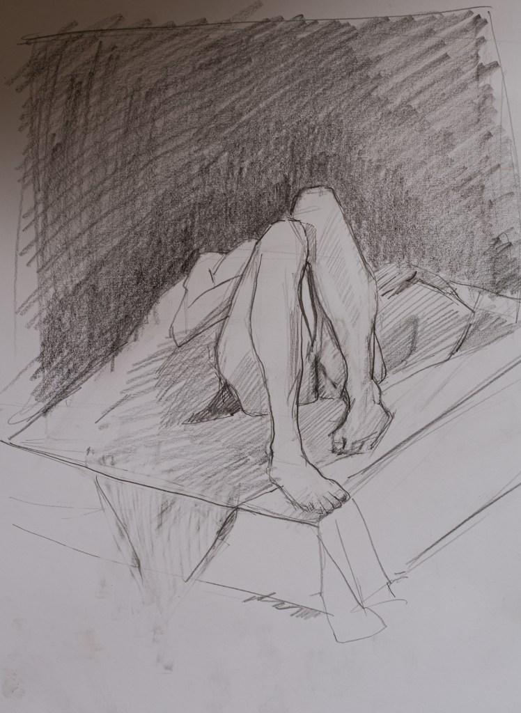
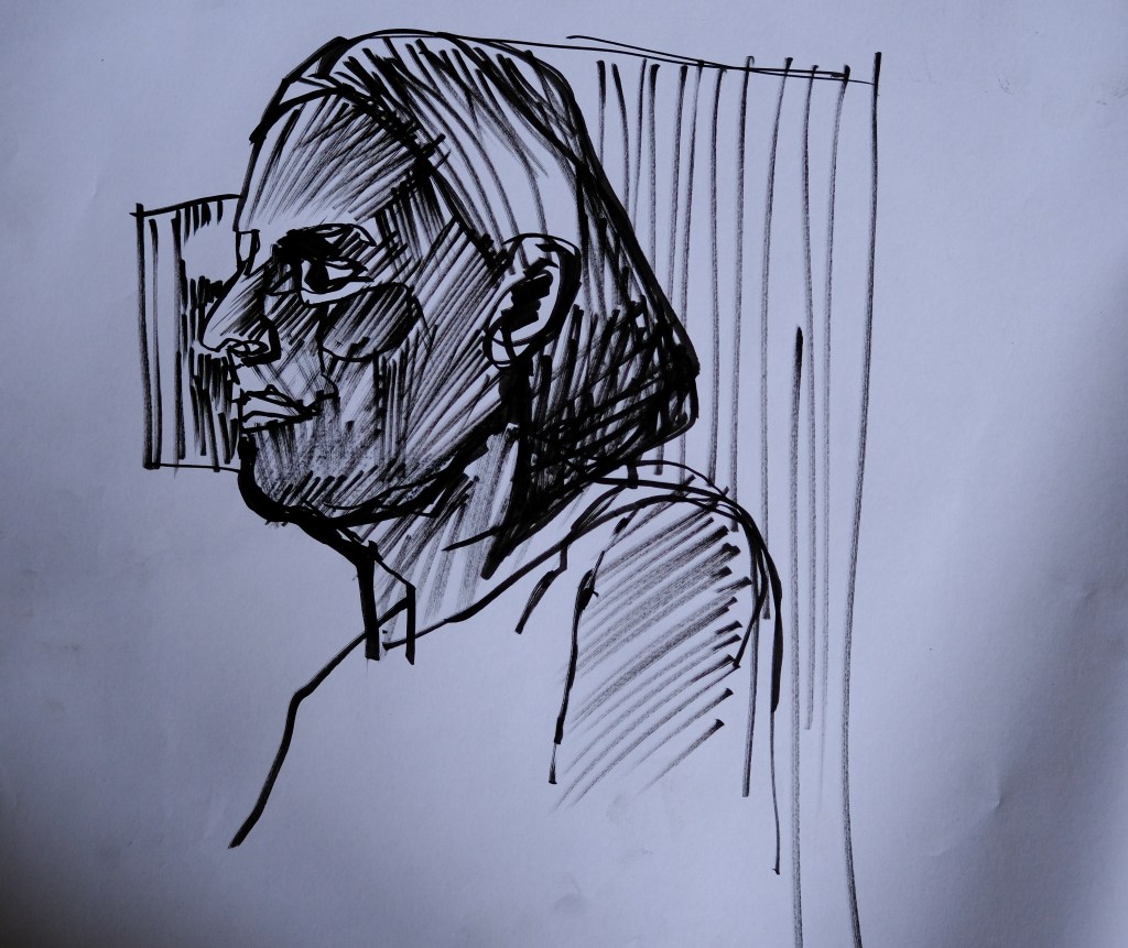
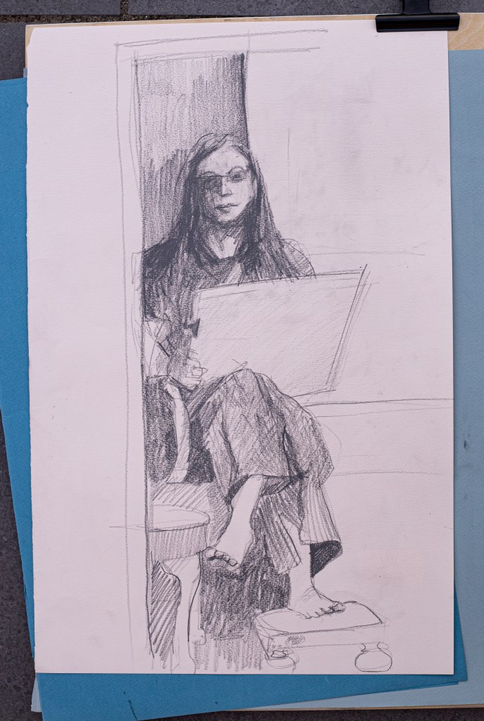
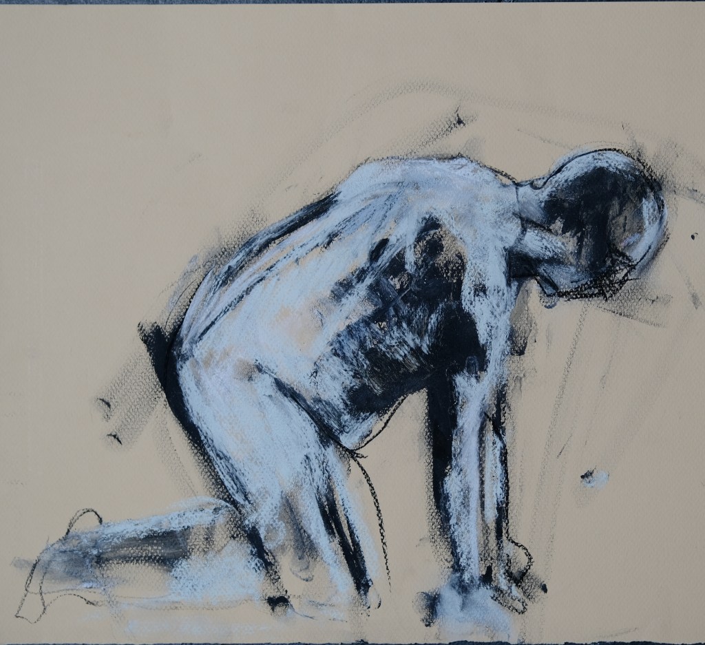
I had trouble photographing the image where I used graphite on mid-dark grey paper. I had to push the whites to even get the pencil to how up – in pushing and pulling the image around in lightroom I ended up with a couple of images that have a good deal of atmosphere – something that I struggle with in the life room. I’ve also started using ink as a drawing tool and it seems that my life drawing is getting more confident and I am no more able to experiment – hope this trend continues! LD 3 times a week certainly helps! Finding new approaches to mark-making, line composition and the pursuit of form remain the reasons for the time spent – plus observational training and I do love the intense focus of the life room; it feels mediative while highly active. The shared sense of purpose, the sense of doubt about performance, and focus feels somewhat similar to playing co-op in a game.
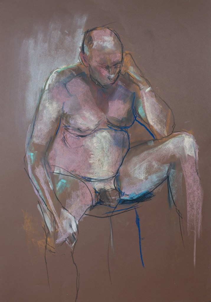


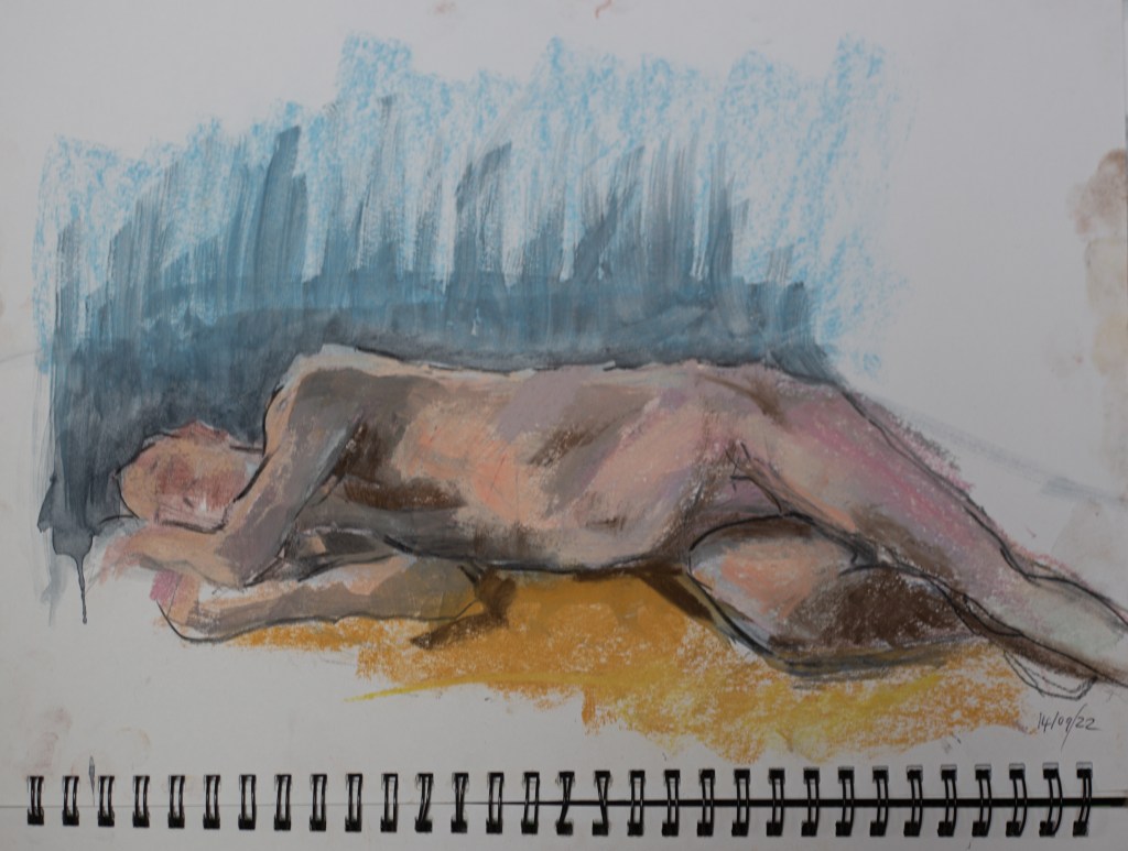
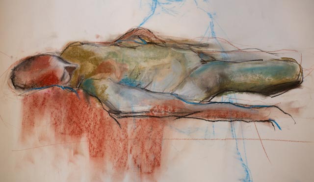
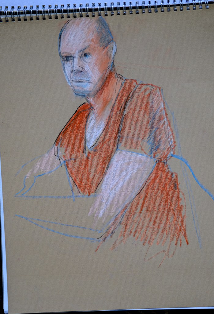
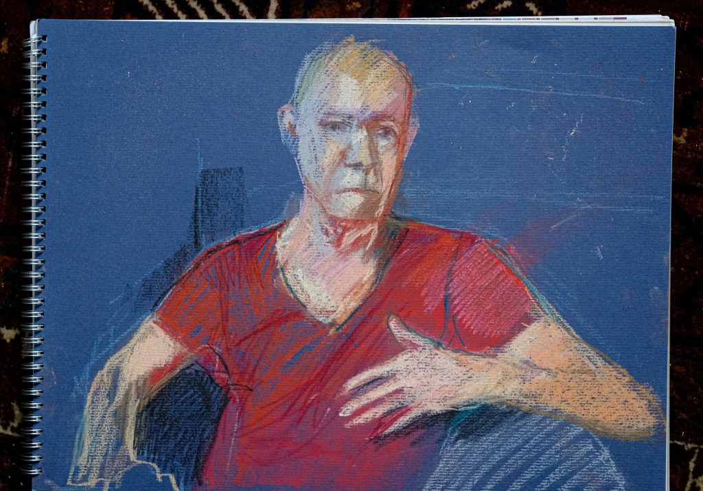
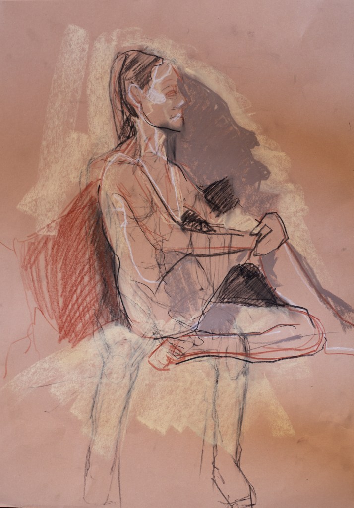
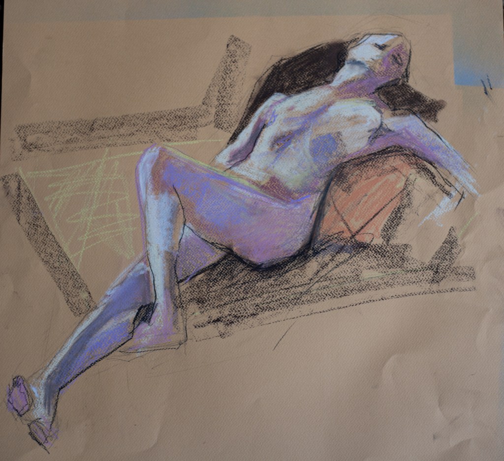
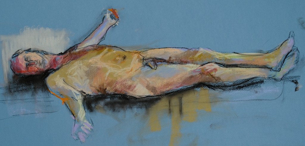
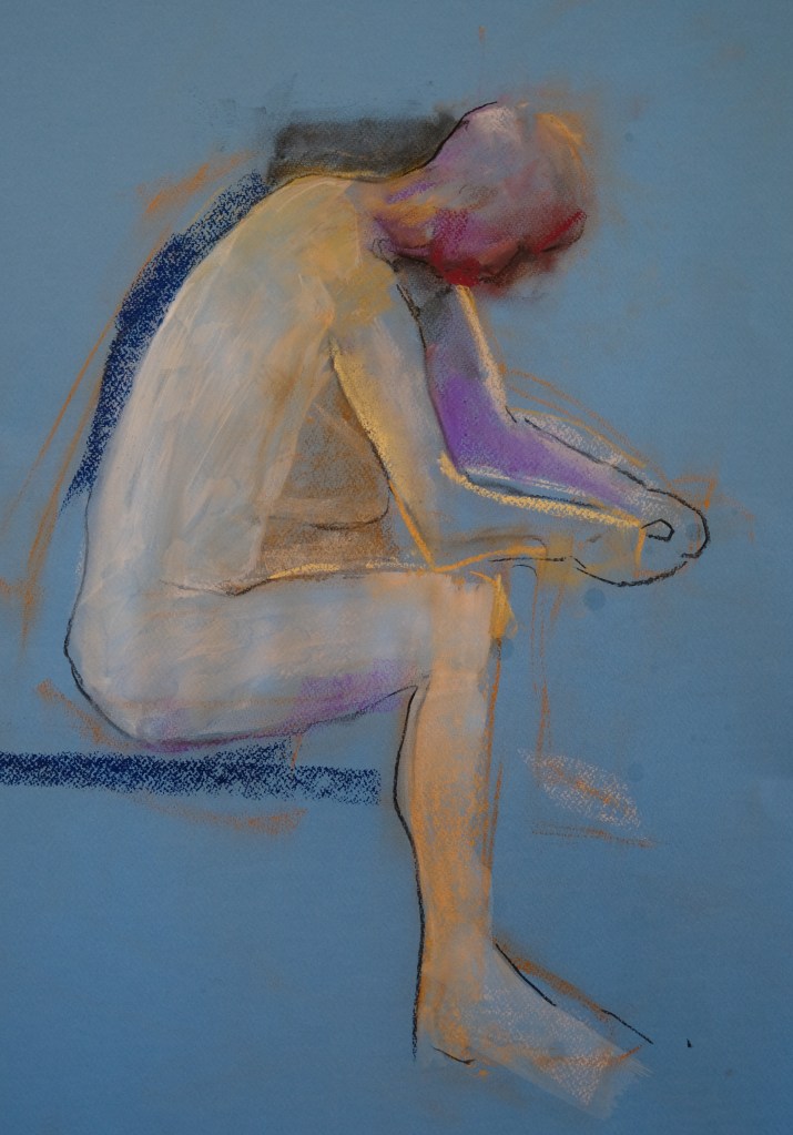
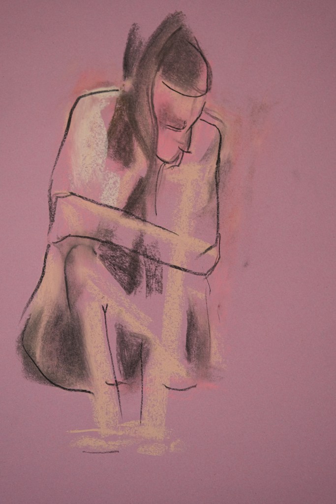
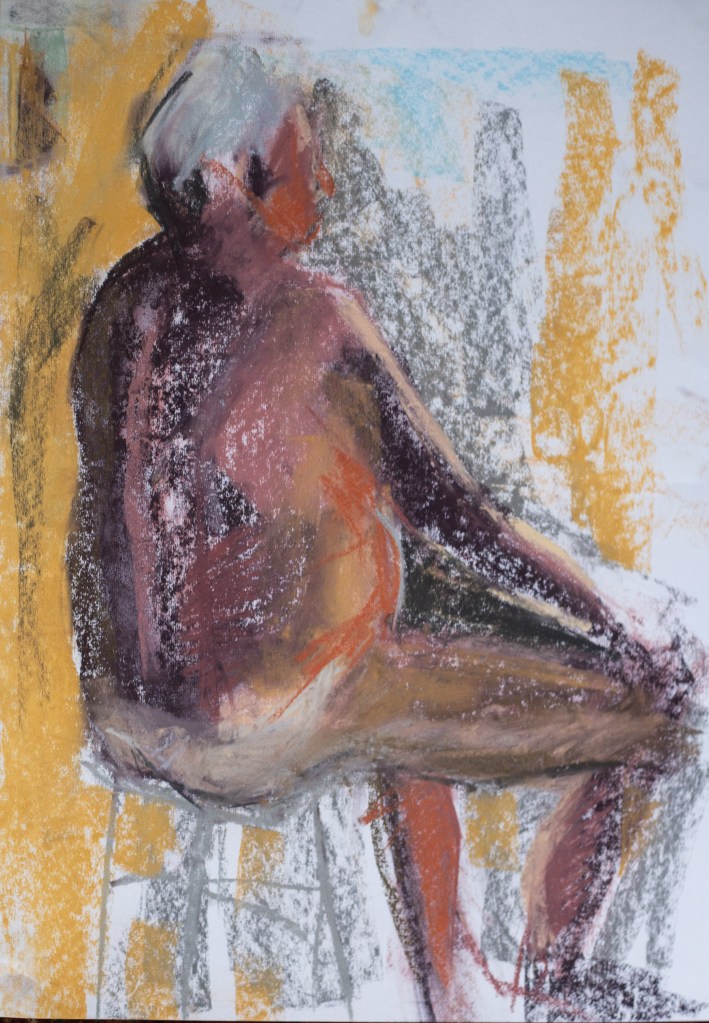
Slightly longer poses than usual, more time to work on colour and form. Thinking is towards more mystery, atmosphere, as well as positioning the body in space…that later is perhaps less good in the last one where I had trouble with the foreshortening of the nearer arm mainly because I didn’t correct the position of the head which I knew wasn’t quite right in relation to a heavily defined shadow between the neck and the shoulder. I’m enjoying working with pastels. This past month has been very busy with work as well as open studios and the show, so the life room has been keeping me in touch with the doing of art and also giving me some hope that I might be able to marry figurative with landscape in relation to folk horror thematics 🙂


Plan is to do more reading around pastels to bring to next class.


Marazion 18/08/22. More abstraction….


Why did this session feel easier? Less pressured, more interesting light, simplifying materials. Sitting down to draw. Pencil comforts! Greater focus on large shapes which the dynamic lighting helped with (at St Ives often the lighting is flat). 26/08/22.

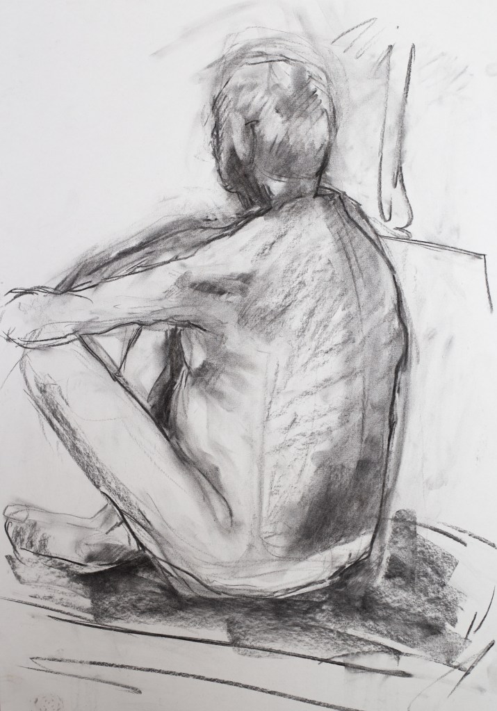
This last set of drawings I am less happy with; decided to go with charcoal for the two longer poses and they are ok but the other two and one or two that I didn’t post that weren’t up to much. More lost and found might be it.
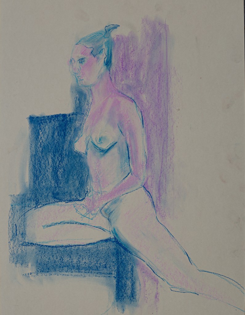
layer order is really important in getting the colours to work with pastel – once again too many colour chucked in! Struggled with the width at times too. Wondering if I should spend more time reading my own blog..easy to forget to actually read and take heed! Graphite as watercolour and some marks with pastels work ok on white but pastels alone seem to work better on coloured paper.


Quite considered work facilitated by 30 mins poses. Tried using watercolour and pastels for the latter one – something I’ll experiment more with. Next week I am on an experimental figure course so hoping for some new roads into my life room practice. Shake it up and not get so hung up on the technical shortcomings.